

Retreat Report
/As regular readers of this column know, I headed to a cabin in Ellijay, GA, this past weekend with my Lichtenbergian brethren for a Retreat, and I am happy to report I was productive.
My goal was to work on the design and layout of Lichtenbergianism for Kids, and I made some really strong progress there.
First of all, in a brilliant TASK AVOIDANCE, I actually revised the text again. I found spots where I should have given fuller explanations, and there was problematic language that I cleaned up.
Then I tackled the design of the book. Part of this issue was technical: I was diving back into Adobe InDesign, which I haven’t used in three or four years. I began using the software back when it was Aldus PageMaker; it’s been my go-to layout software for 40 years. But after one system upgrade or another, my old Adobe Creative Suite 5.5 stopped working, and I am not a fan of current “subscription” practices, especially when it’s software that I use maybe once a year.
However, my most recent substitute, Affinity Publisher, while robust and certainly affordable, wouldn’t automatically lay out footnotes, so I caved and subscribed to InDesign. Hold that thought.
After a couple of tutorials assured me that InDesign works like it has always worked, I played around with the software a bit, but was getting nowhere.
Then I bethought myself, “Self, what would Lichtenbergianism: procrastination as a creative strategy tell me to do?”
“Make lots of crap,” I replied to myself.
So I grabbed the nearest WASTE BOOK (though not the one I had dedicated to planning L’ism/Kids because I left that one at home) and began scribbling page designs.

(Notice the sudden design decision to pull footnotes into their own sidebar.)
But this was not breaking new ground. I decided to sketch out grotesque, ugly, unworkable layouts.

I was especially proud of the “self-published novel” concept: wall-to-wall text with 1/2” margins and no white space.
And then the universe handed me this:

Light gray dot-grid background. Blank out the text frame, but everything else overprints on the grid. Notice my decision to go back and include the Airport Version, mostly to drive home the idea that the reader can and should write in the book. (I’m going to stick in a little graphic that encourages the reader to write their name, to make that first mark and get it over with.)
More SUCCESSIVE APPROXIMATION, after mocking it up in InDesign:

Font choices, transparent image (for dot-grid visibility), and did you notice that last bit? InDesign can automatically lay out footnotes, but only at the bottom of the page. If I want them in a sidebar, I will have to do them all manually.
(However, later in the hot tub, I mused a possible solution. More work is required.)
There’s one more design decision that I’m quite pleased with, but I think I shall keep quiet about it and see if anyone notices.
BUT WAIT, THERE’S MORE…
Lichtenbergian Turff is the chief engineer of the GALAXY Project, and he brought a ton of stuff to begin working in earnest on the wiring. (GALAXY was funded at the Alchemy Art Fundraiser!)
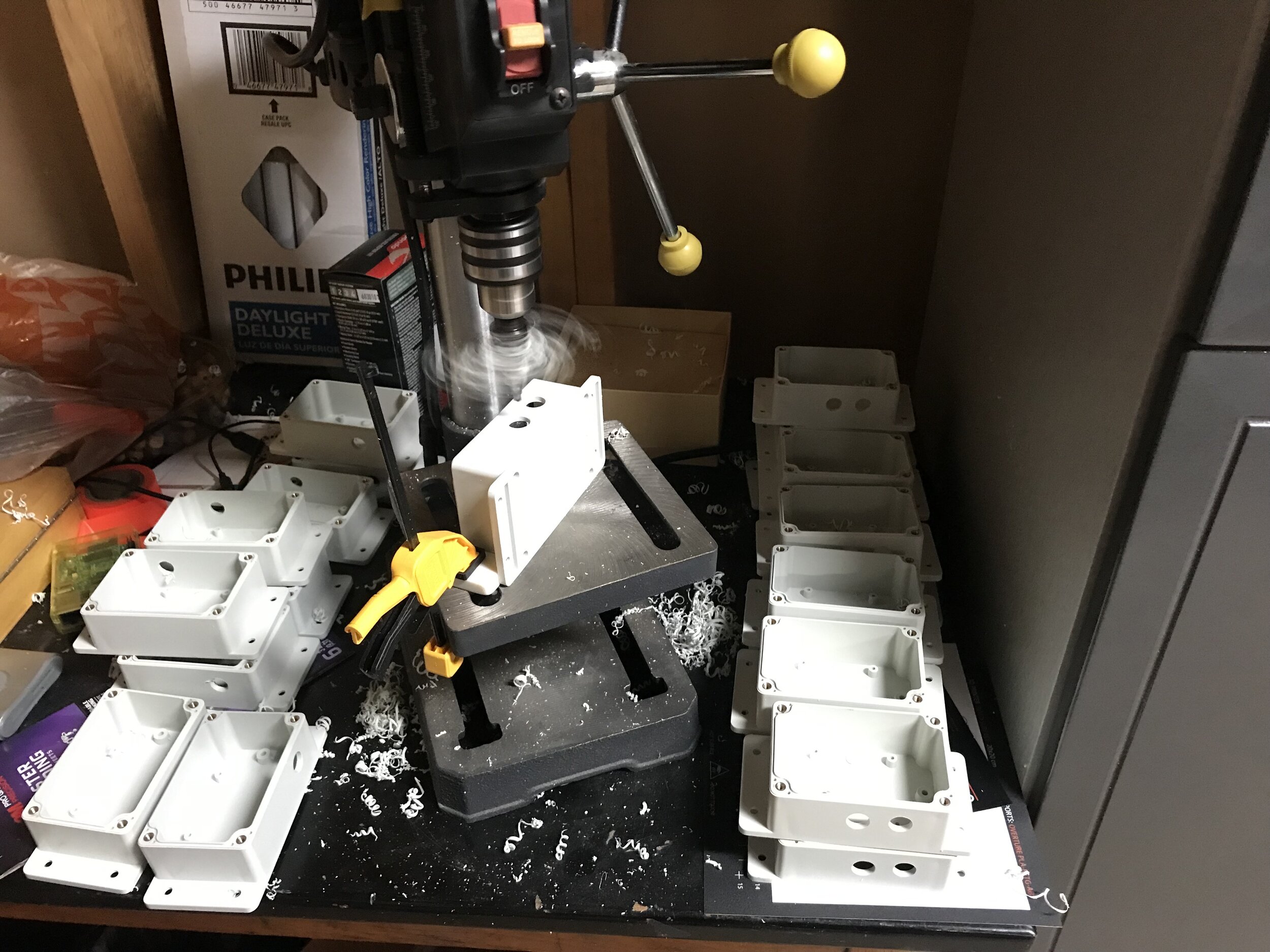
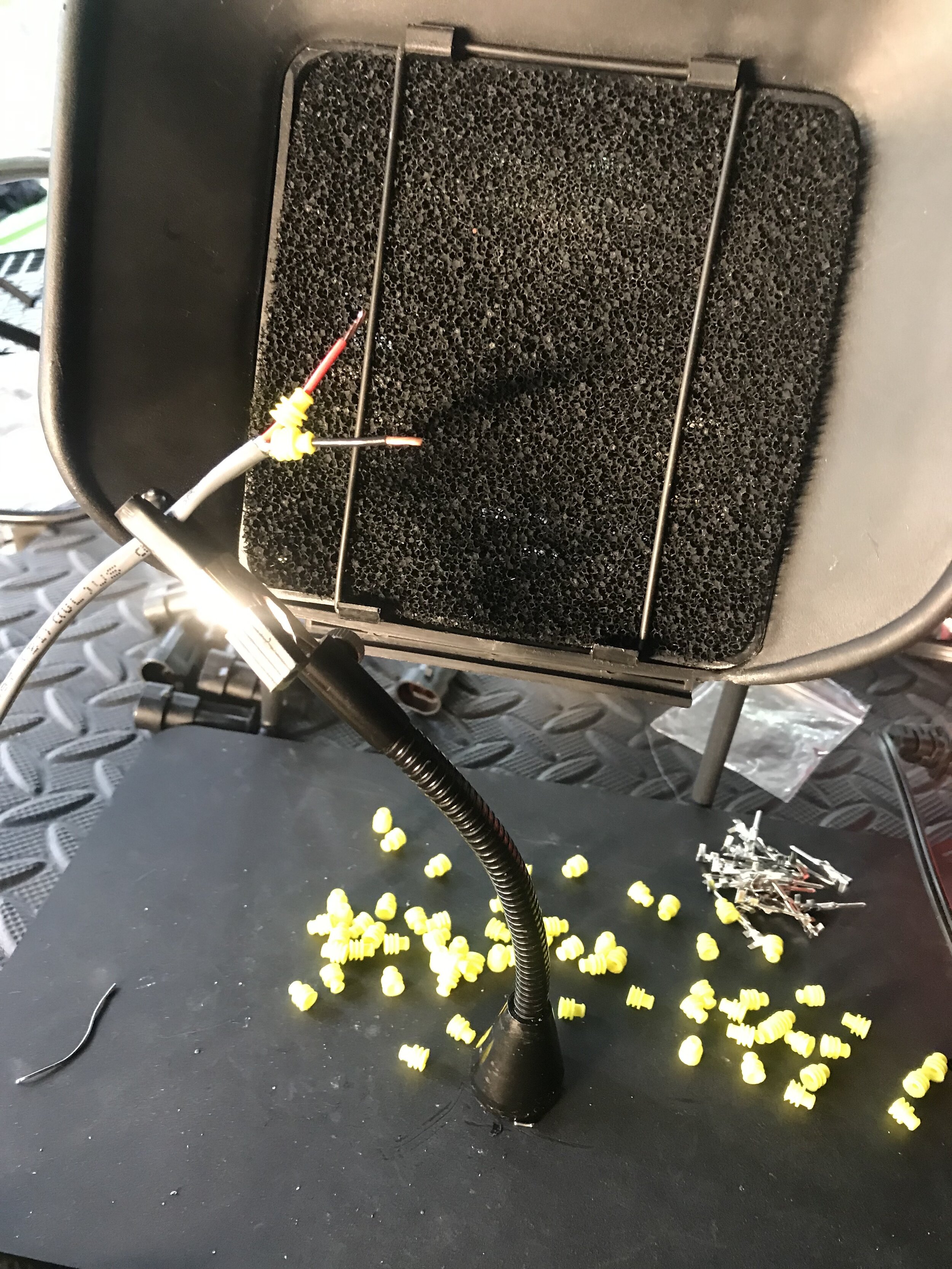
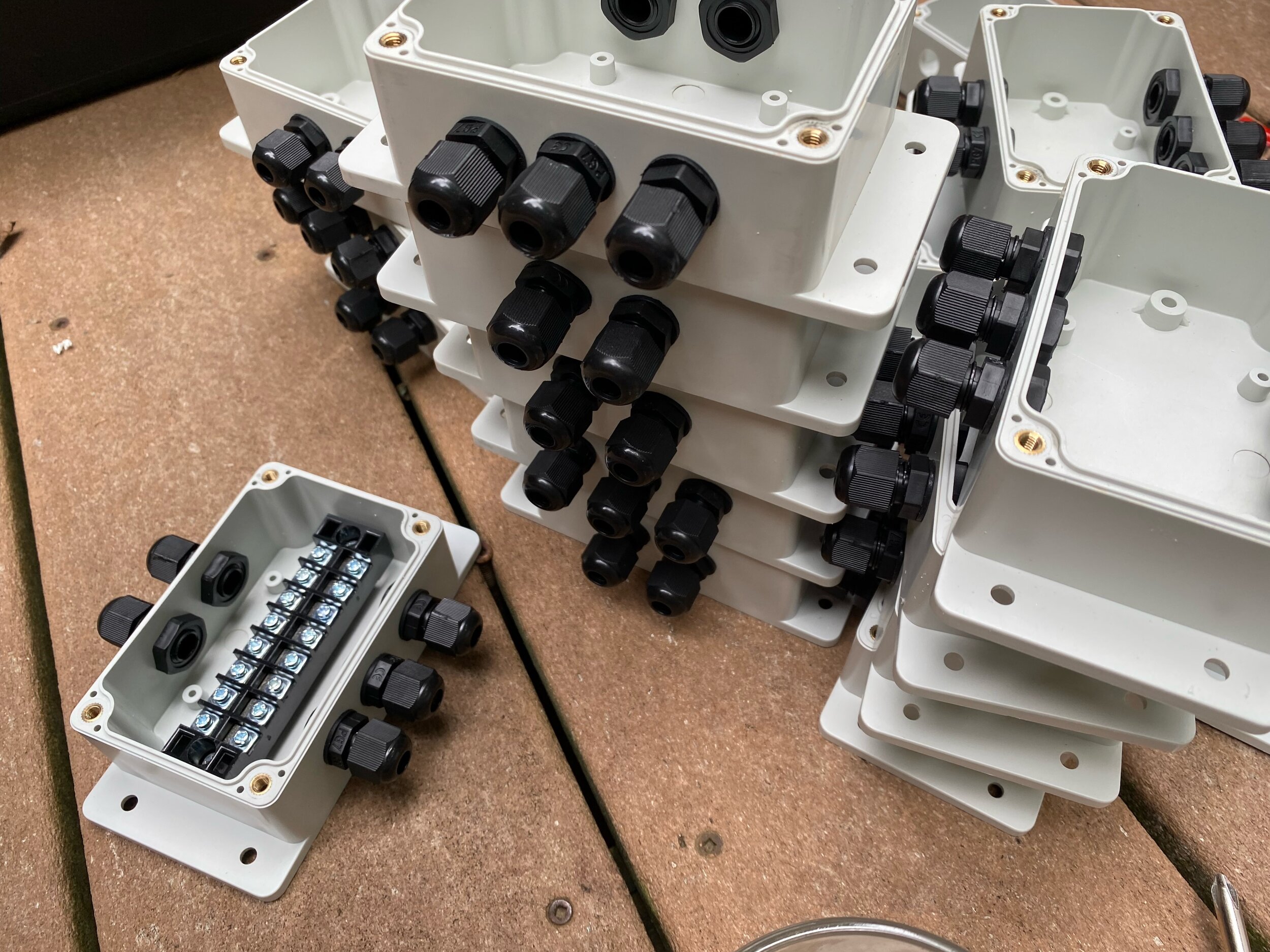
I am pleased to say that I was able to help with some of the gizmos, though the amount of wiring/soldering/attaching that still has to be done (28 junction boxes and some 500 plugs/wires) is daunting. (Sign up to help.)
I had asked Turff to bring Zone 1 so we could test it out on the gang, and 1) it was really easy to set up, which bodes well for the burn; and 2) it totally worked.

We’ll probably paint the junction boxes black, and of course at the burn the rings will be elevated on little stands.
Behold!

This is Zone 1, one set of 28 rings, out of 196 rings. This is going to be spectacular.
