

Other people's Successive Approximation
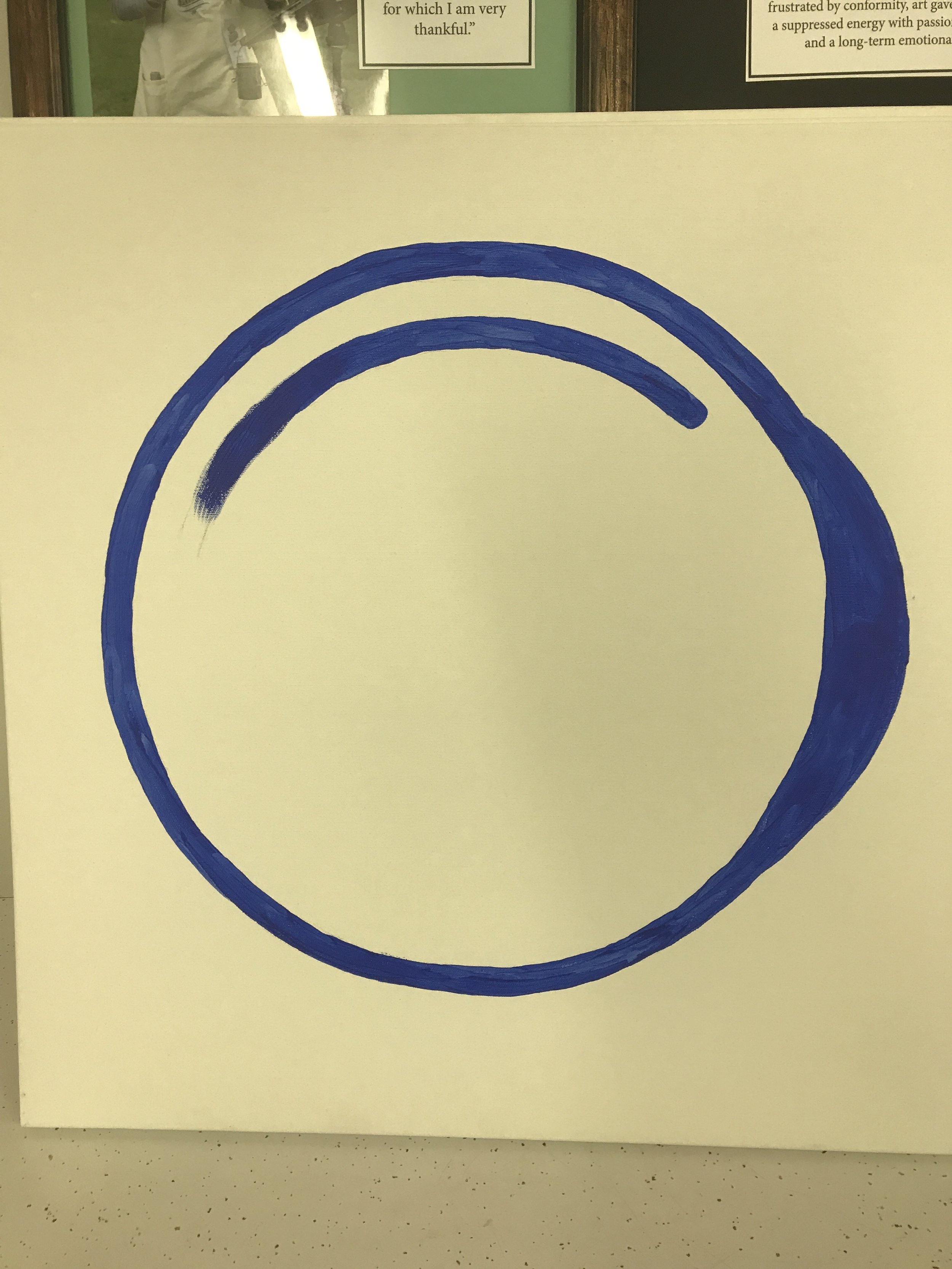
/Last Thursday I drove to a studio in Atlanta and was part of a team creating an online video to convince ophthalmologists to use a new treatment/drug for "blinding diseases." My part, as you might recall, was to provide six canvases painted with a stylized cross-section of the eyeball.
These canvases were to be used by a pretty young woman named "Hope" who would chat with the audience while painting the image. They progressed from "just started" to "completed," and the idea was that we would switch them out between shots as she painted and chatted.
There were two other elements in the storyboard that I was given: the older, to-be-deprecated treatment, involving injection into the vitreous and depicted with a rust-colored paint; and the new, to-be-preferred treatment, an injection between the choroid and the retina, depicted by a lovely, calm sea-green. I brought two tubes of brown-ish paint and two different greens.
Here's where I learned a lot about SUCCESSIVE APPROXIMATION in the world of commercial video. Since this is my only experience so far, it may be anomalous, but I'm thinking it's probably typical.
Never used.
First, the director decided to skip the first stage of the canvases and start us with the second stage, and even then wanted the inner circle extended even further. In the end, we used only four of the six canvases.
Then, as we were setting up to begin the shoot, the agency (new themselves to the business) let us know that the preferred treatment we were trying to sell was not actually replacing the first treatment, just supplementing it, and so we weren't going to be depicting it as yucky brown.
I called the production assistant, who was out buying an easel, and asked her to pick up a tube of magenta, figuring that would be a lovelier color.
Then, as we progressed into the "finished" canvas and prepared for Hope to explain to us why the first treatment was OK if you were into that sort of thing but that this second treatment was the cat's pajamas, the agency decided that while we didn't want to deprecate the first treatment exactly (because medically it was still accepted protocol), we certainly wanted to make our treatment look better.

Choices. So many choices.
That meant deciding on a color other than magenta. After a good fifteen minutes, a puce-ish gray was settled on. Then we had to decide what kind of shape/motion Hope was going to paint. Then she had to practice. (Hope was not a painter in real life.)
When it came time for Hope to inject our wonder drug into the suprachoroidal layer, another debate ensued: green would connote glaucoma medication to doctors; this color didn't feel right; that color was used by a competitor—and finally they chose magenta.
You might think this was frustrating for me, but it wasn't. After all, I was there simply to make the canvases work for the people who were actually responsible for producing the ad, who were all cheerful, funny, and professional. The only stress I had was making sure that I was doing what was needed.
The point, Lichtenbergianism-speaking-wise, is that while it may be possible to make all these kinds of decisions ahead of time—Alfred Hitchcock was notoriously thorough in his storyboarding and following them to the letter—it is not completely necessary. Flexibility is key; SUCCESSIVE APPROXIMATION is your friend.
All you have to do is keep doing it until it's done.
—————
Feel free to leave comments on this or any other post!
