

Klee exercise, pt 3
/I’ve decided not to push myself on the STEAL FROM THE BEST Klee exercise. The painting is on my drafting table, and maybe twice a day, as a distraction — a TASK AVOIDANCE, if you will — I’ll paint in a block or two.
After a week, here we are:

Here are further musings as I STEAL from Klee:
As I proceed, I am conscious of color distribution. I keep thinking of the “4-color map problem.” Should I be more organized or deliberate about the arrangement? Will it be okay at some point to have adjacent areas the same color?
My colors are brighter, more pure than Klee’s, because I’m pulling the colors straight off little cakes of paint, and I’m sure he used the real stuff in tubes on a palette.
Notice the gray C. It was only after I had painted that square in that I realized that C’s create an issue since they don’t offer a closed-off boundaries for differing colors. I referred to Klee, and found that the insides of his C’s are pastel, and that shading continues around the tips of the C before it goes darker. In other words, when I go back to draw the letters in with black, the tips of the C will stand out.
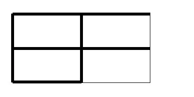
In that same vein, I wondered about legibility. For example, if I have an E and an F next to each other and drew the lines all the way across the box, it would look like this:
So when I finish the colored mosaic and come back to draw in the letters, should I shorten the crossbars? Klee seems to have done so, but not consistently.

Or, and this is the main point, I think: Is legibility even an issue with this piece? More work is required.
Speaking of more work, this past Saturday I went to the Alchemy Artist Social, at which the burn art department offered guidance to those of us who want to build Large Art Burns.
My idea, you may recall, involved pine saplings, 5–6-foot pieces, sharpened at either end like toothpicks, arranged in rows like palisades, and multiple palisades arranged in some menacing maw kind of configuration.
Burners would be invited to write something about their particular trauma/shadow, fold it up, and then drive it between the saplings with wooden wedges left over from the sharpening. As the burn went on, the fearful monster of the sculpture would be overwhelmed with “slings and arrows,” and on Sunday afternoon, we burn it.
The theme of the burn this October is Lighting the Void, and I’m calling this piece “Rage Against the Night.”
Anyway, I took my pieces of cardboard and my scissors and some tape, and I worked on visualizing this sculpture, creating multiple ABORTIVE ATTEMPTS and getting input from Ernie (who is a god) on actual construction.
(One interesting thing about the collaboration involved is that Ernie and the others tended to be representational/figurative — they wanted to put a face on it — whereas I’m an architectural abstractionist. Of course, in my description above and on the application to be a LAB artist, I did describe it as a “monster.”)
My first idea was a simple wall, a literal palisade. I curved it and tilted it, and it was a beautiful thing — but I soon realized it wouldn’t burn beautifully.
I took two walls, intersected them, and curved them inward:

Everyone oohed and aahed — this one was pretty impressive and would burn well. These first two ABORTIVE ATTEMPTS reminded me of the work of sculptor Richard Serra:

SERPENT, richard serra, 1996 — click for more images!
You can see his influence on my thinking.
I played around with shorter segments, keeping mind not only the sculptural qualities but structural integrity — projecting segments still have to stand up to being hammered on — and safety — it should be clearly unclimbable and cannot have a roofed interior. (The local fire marshal gets really nervous about stuff like that.)
By the end of the social, I still had no design, but the team had given me lots of ideas as well as assuring me that all my ideas could be built.
Interestingly, I think I have an idea for a design that will actually work and would actually make the figurative artists happy, but I have to get it out of my head and onto my desk. More work is required.
