
Keep going
/I thought hard before naming this series Keep Going; it is after all the title of Austin Kleon’s wonderful third book, and this is not that. This is just a record of my attempts to, well, keep going.
As I said on Monday, one way to keep going if you’re stuck is to start a project about which you care absolutely nothing: the ultimate ABORTIVE ATTEMPT. Today I did just that by playing around with fonts.
First of all, it is widely known that I am a font junkie. I am not ashamed to admit it. At this moment I have over 1,000 fonts available on my laptop, and before I leave all this behind I imagine I’ll have double that.
Second of all, let me apologize up front for not give you a source for any of the fonts I’m about to show you. Some are old favorites, some are brand new from Pixel Surplus, who offer some nice deals on fonts on a regular basis. (They can be repetitive, derivative, or limited, but mostly they’re fun to have around.) Some are free, some are bought. Some are “professional,” in that they come from major type foundries; others are done by independent designers. Google is your friend.
I started the day by working up a wonderful phrase that popped up on some political discussion in the last week or so. (You will of course understand if I have shoved all details of all politic discourse out of my head for the time being.)
“Moving backwards in the right direction”
Perfect description of the Lichtenbergian Precept of TASK AVOIDANCE, ne-ç’est pas?

Isn’t that great? That is a font called La Tortuga, and it was part of a huge bundle from Pixel Surplus.
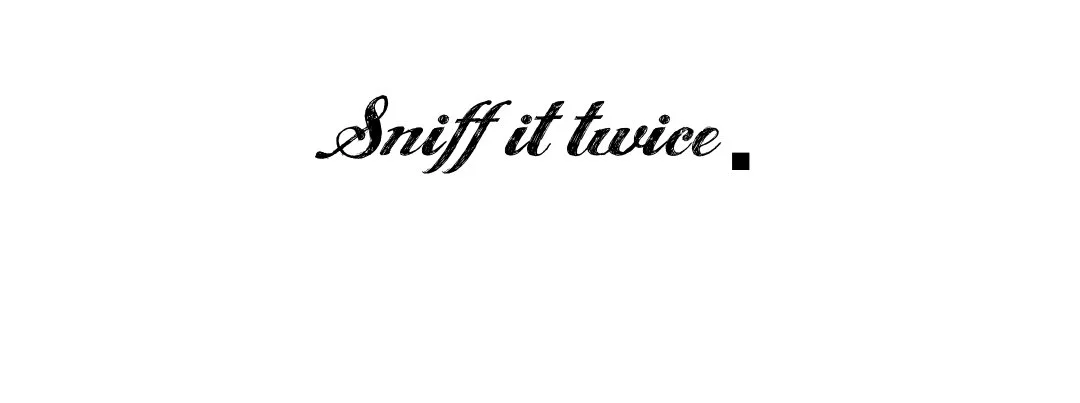
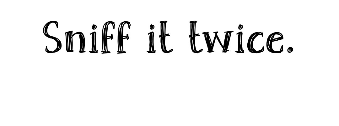
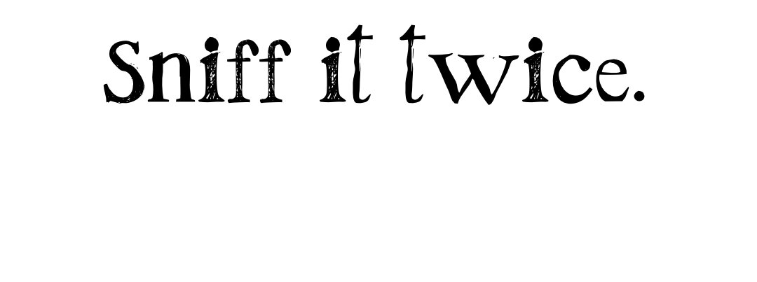
Finally, the phrase I chose to work with this morning came from the Lichtenbergian Society’s Aphorist, Marc, at a dinner at his house recently: “Sniff it twice.” It’s funny, and as you will see, the words soon lose all their meaning. It becomes pure design.
And now, the results of my playtime, in an exercise that has produced precisely nothing but this blog post, not even a t-shirt you could buy. (Although if you want a t-shirt that says “Sniff it twice,” do let me know.)

font: Abecedarian
font: Angel Tears

font: bobsmade font
I noted this a couple of decades ago, that for centuries the goal of type designers and foundries everywhere was to create sleeker, cleaner lines in their fonts — and as soon as we had the digital world at our fingertips, where everything is easily perfect and crisp, we went the other way: distressed letters, rough edges, uneven surfaces.

font: Bodoni 72 (a classic font, not one of these newfangled glitchy things )

font: California Sunshine

font: Gilbert Color
Let me pause here, after the ridiculous Gilbert Color, and point out that almost all of these are display fonts, i.e., fonts you’d use on memes or t-shirts or book covers. They are not for setting text, stuff you want actual human beings to actually read. That’s your fair warning.
Many of these typefaces come with multiple fonts, both the usual like italic and bold, and the more trendy ones like rough or stamp.

font: Havior - Halftone
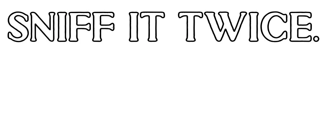
font: Havior - Outline

font: Havior - Stamp

font: Keep On Truckin’

font: La Tortuga

font: Legion

font: Leonetta
Script fonts are special. They can be elegant, but mostly they’re illegible and in my book that’s a no-no. Don’t ever make your AUDIENCE have to figure out what you’ve typed. (viz.: metal band logos)

font: Love SVG

font: North Port
Part of the movement to imperfect fonts is the retro hand-lettered look. How long before we’re back to our graphic artists just using their tablets to hand letter everything?

font: OneAfter909

font: Paris 1920 Script
font: Pine Forest
A lot of the bundles from Pixel Surplus seem to be aimed at people who are designing logos for beer cans or Instagram stickers. In fact, there’s usually an attached packet of logo badges for you to modify. The trick seems to be one stolid font accompanied by a flitty one.

fonts: La Tortuga & Lanier Regular
Anyway…

font: Puppeteer

font: Retro Rock Poster

font: Santos Dumont

font: Saturday Market

font: Scandilover

font: Screwed Up Typewriter

font: SF Gushing Meadow

font: Shine SVG

font: Sidewalk

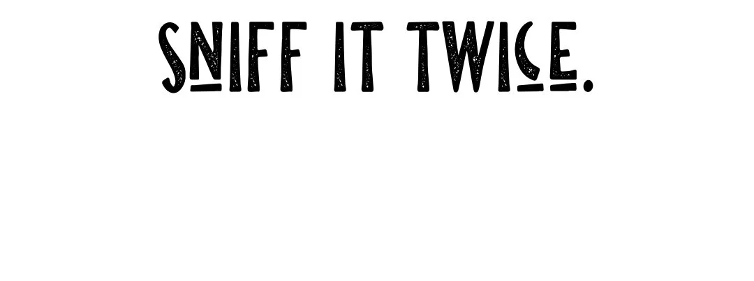
font: Sketchetik
font: Skrawk Serif

font: Snob

font: Swiss Grit

font: TC Brixton Outline

font: Tosca Zero
You will recognize Tosca Zero from your REVEL IN THE DISHEVELMENT t-shirt.
font: Westsac
And one last one…

font: Yonder
And there was my ABORTIVE ATTEMPT time-wasting project for Wed, Nov 4, 2020. I got one good meme out of it, so that’s not nothing.
Carry on! Keep going!
