

Here, have a little Task Avoidance...
/On my handy dandy schedule, I was supposed to write about editing the chapter on SUCCESSIVE APPROXIMATION, because I found that I had used the same anecdote in both that chapter and the one on GESTALT. I was going to show how I used GESTALT to reconcile the repetition.
However, two things happened. First, I didn't actually get the editing done.
Second, TASK AVOIDANCE for the win, you guys!
As one of my Lichtenbergian Proposed Efforts this year, I am starting a writing workshop at our local Backstreet Arts, an art space for the homeless and other underserved populations. (I'll keep you posted once we get started next month.)

Go check them out. And give them money.
Backstreet has its own logo, of course. So the writers group needs to piggyback on that, right?
So rather than get to work editing Chapter 6, I wasted some time playing with fonts because TASK AVOIDANCE always works.
Let's take a look, shall we?
Clearly, the logo needs to be the BACKSTREET part, with Writers underneath it. My first thoughts were that it could be in some kind of handwriting/calligraphy font...

font: Mathilde
...but in general handwriting fonts are not very legible, which would be counterintuitive for a writers group.
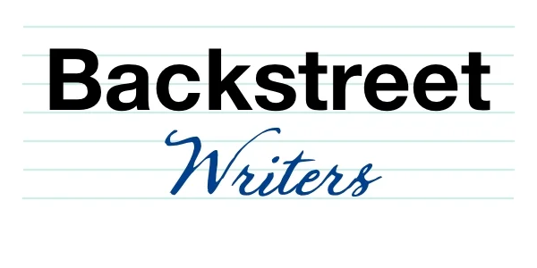
font: Sherlock
Plus, there's just too much contrast between the BACKSTREET and the Writers. (Yes, I know that I overlooked the all-caps nature of BACKSTREET. That's the next Successive Approximation.)
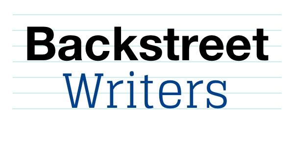
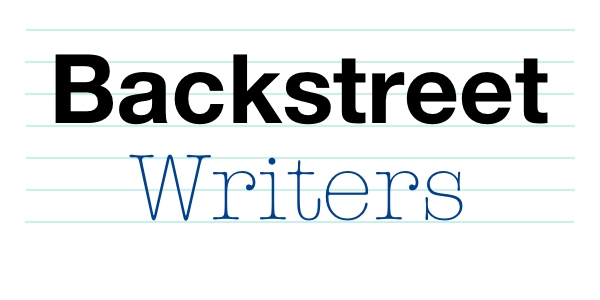
So here are some other Successive Approximations:

font: Ambassador serif

font: Baronessa
font: Glegoo

font: Skrawk Serif
font: American Typewriter light

font: Cutive
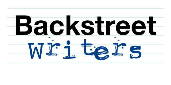
font: Screwed-Up Typewriter

font: Tosca Zero
After a while the word Writers doesn't even look like a word any more, you know?
Anyway, each of these has its charms. I really like the Tosca Zero, but once I convert BACKSTREET back to all caps, that may not work.
BUT THEN...
A funny, marvelous thing happened. I had already decided against a script font, but I went back to create an image using Sherlock for the purposes of this blog post. It has several flavors to choose from, and one of them was called "Stuff Dots." And LOOK! BEHOLD THE POWER OF ACCIDENT!

font: Sherlock Stuff Dots
It's an alternate set of images that can be used in your typesetting, all ink splotches (for the capital letters only, hence the riters.)
So now I have something really cool to add to the mix:

This may eliminate Screwed-Up Typewriter, for example, because it makes it too messy. More work is required. I need to go find something else to avoid working on.
